This blog post is a part of Mobilizing websites with responsive design and HTML5 tutorial. For all posts please see the Introduction post.
By default, modern mobile browsers render websites in a “virtual screen” mode (viewport) where they allocate a virtual screen wide around 900 pixel for the webpage rendering. Then the users can pinch and zoom themselves around in this viewport. The default desktop-ish viewport in mobile browsers is for the legacy reasons; non-mobile aware legacy layouts would blow up if they were fitted into a small mobile screen estate.
Pinching and zooming around is not what we want to do – it makes the browsing experience constant pain of finding the start of the next paragraph. Setting a “normalized” viewport is the first thing you do when are mobilizing a website. This tells mobile browsers that the site is mobile browser aware and the mobile browser should use the actual mobile screen dimensions instead of virtual pan and zoom screen for rendering the web page.
This happens by settings a <meta name="viewport" > tag in HTML <head> section. The tag was introduced by Apple on iOS devices and has been later adapted by other Android, Opera, Firefox mobile browsers.
Here is an example:
<!--

    Set a mobile viewport which uses actual mobile screen dimensions instead of
    a virtual screen, but still allows user to zoom in for visual impairment

-->
<meta name="viewport" content="width=device-width, initial-scale=1, maximum-scale=5">
This viewport tag says that
- Use device native screen width instead of virtual screen width
- Set scale to 1 when the page is opened
- Allow still the user to zoom in (maximum-scale=5). Some mobile site disable pan and zoom altogether of having maximum-scale=1, but this is not recommended as a lot of elderly people like to zoom into text even if the text is very large and optimized for small screens.
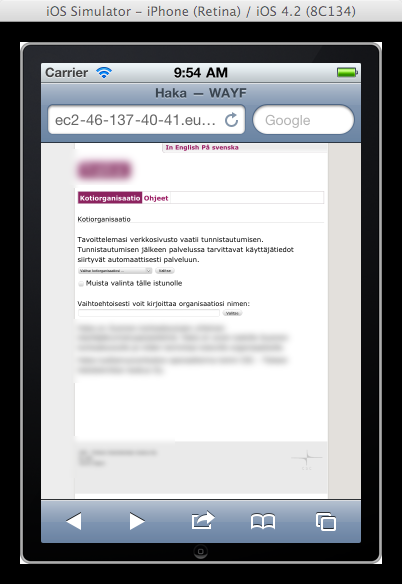
Before the viewport tag was applied:
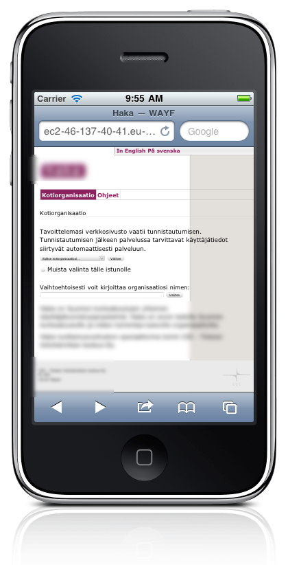
After the viewport tag has been applied:
As you can see there is a clear difference in the page rendering, but this is not definitely enough to make the site look good on mobile: the CSS styles must be fixed also as usually legacy CSS styling uses “min-width: 960px” or similar horizontally centered main column definition. Since we don’t have that 960 pixels in mobile screens, the layout cannot work properly yet. In the next tutorial blog post we’ll show how to fix this with CSS3 media queries and CSS overriding mechanism.
Note: As the viewport tag is not very standardized yet, there exist tons of pitfalls with it. Especially if you try to dynamically edit it with Javascript you’ll get undesirable results or no change. Always inject the viewport tag on the server-side into HTML payload.
Note: The viewport tag may affect iPad and Android tablets. The desktop browsers ignore it, though. Test your mobile site with the tablet devices also.


