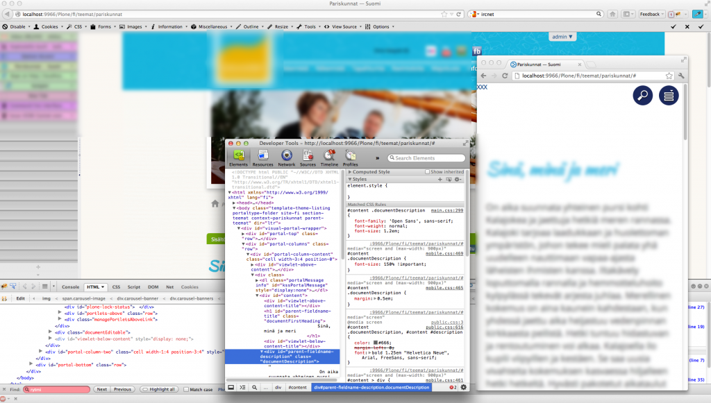
I am building a new mobilization add-on for Plone CMS. I’d like to share the following workflow which I found greatly to speed up CSS tuning tasks for responsive design
- Use CSS “screen and (max-width: 900px)” media query to switch between desktop and mobile versions
- Open the site in full screen Firefox. This is the desktop version.
- Open the site in Chrome and shrink the window until the max-width discriminator kicks in. You get the mobile version.
- Detach Developer Tools Window from Chrome main window which is now too narrow for the tools.
This way you have CSS debugger for desktop and mobile versions open simultaneously and you still use your screen real estate effectively.
A mobile version and Chrome’s CSS debugger on the top of desktop Firefox.

